
Perception is reality

Another chart found this time by a Head Teacher I am working with. This time from "local government".
One of my previous head teachers taught me a phrase – “Perception is reality” – used for many purposes; to spur us on during inspection, to praise when initiatives went well and to feedback / motivate when things went wrong.
This is equally true for data.
Certain “perceptions” seem to be universal. Things like “bigger is better”, time moves from left to right (in Western society), we perceive things increasing or getting better as we can a chart from left to right (again, in Western society).
Look again at the chart - it seems to go out of its way to mess with your perceptions. On quick glance, does the chart show an improving or worsening situation? Are the green bars "better" than the red ones?
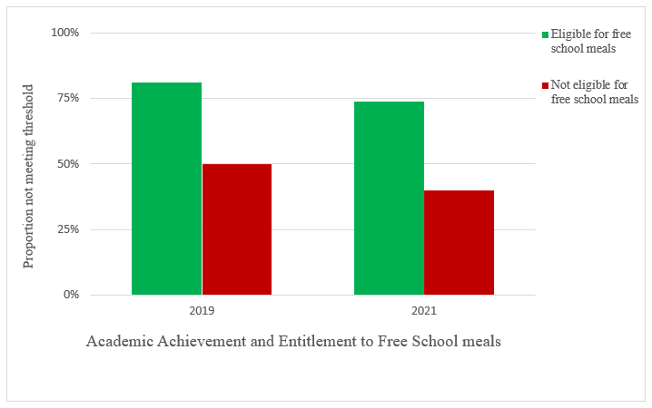
Why its a mess
- The y-axis is showing a negative getting bigger. Read the y-axis title "Proportion not meeting threshold". So a bigger bar shows more children not meeting threshold - bigger is worse.
- We (again Western society) associates Green with "Good" and Red with "Danger" / "Not Good". So even before we try to make sense of the legend on the chart, we are making an opinion about the merits of each vertical bar
- RED / GREEN itself is a challenge. 8% of men are red-green colour blind. Using these colours adds to the cognitive load in interpreting the chart.
- Gridlines - again, adding to the visual noise
- Title at the bottom of the chart - whilst not a showstopper, some consistency is good. Titles at the top work best for me.
Some Excel-fu:
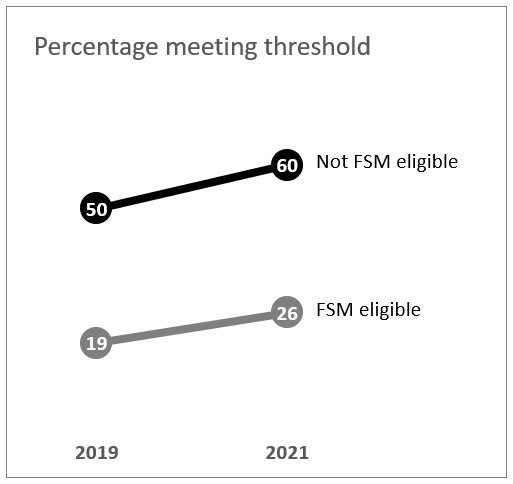
Why its better
- Less visually distracting (lower cognitive load)
- Bars replaced by "data points" with the numerical value embedded - this allows the y-axis to be removed completely reducing the cognitive load even further
- Data is transformed from plotting those "not meeting" to those actually "meeting". In this case, bigger is definitely better.
- By aligning the data vertically, it is possible to compare the values between those eligible for FSM and those not. The chart really emphasises the impact of FSM on outcomes.
- Colours removed and replaced with shades of grey.
Call to action
Don't plot a negative increasing vertically as it really messes with the audience perception of what the chart is showing (Of course that assumes that you didn't set out to befuddle the audience).