
Attendance fail #1
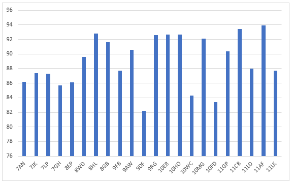
I came across the above chart as I was preparing to work with a school. The chart is presented exactly as taken from the school's website.
It's not clear what story this chart is attempting to tell, but I think it's safe to assume that the purpose of the visualisation is to demonstrate those form groups with the lowest attendance and to allow some form of comparison across a year group and across the whole school.
I think the chart fails in a number of ways.
What's wrong with the chart?
- The chart starts at 82% - this magnifies the visual perception of the difference between any two forms -- the chart is stretched vertically and this distorts our visual understanding of the data. It makes the differences appear visually "bigger" than they actually are.
- The x-axis contains categoric data. As presented, there is no logical order to the left to right arrangement of the forms. Looking closely, there is some attempt at ordering them by year group, but within the years, the data is not in alphabetical order.
- Whilst it is possible to pick out the form (9DF) with the lowest attendance overall, it is not clear how this relates to other Year 9 classes, overall or compared to a whole school target or average.
- As a result, there is no context for this chart - we don't know what a "good" or "target" value is.
- The chart doesn't have a title - not a showstopper, but conventions are there to lower the cognitive load in interpreting the chart.
- Horizontal grid lines - add to the visual noise.
Some Excel-fu later:
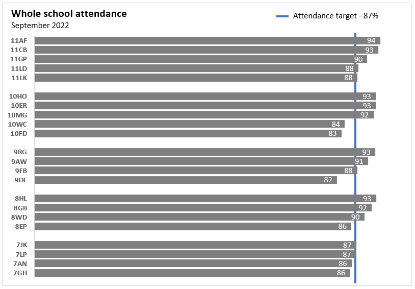
Why is this better?
- The x-axis is numerical. As we track from left to right, number get bigger and therefore there is a logical order to the x-axis.
- The x-axis has been removed as the bars have data labels embedded into the bars themselves.
- The y-axis is categorical, but this time the data has been organised vertically sorted by attendance and then alphabetically.
- The y-axis has white space separating the year groups - this reduces the cognitive load in interpreting the chart.
- From the school website, a school level target for attendance was identified. This has been added to the chart as a vertical line. This enables direct and straightforward comparison.
- Colour removed from the bars and used to highlight the attendance target.
- Those forms that are furthest away from the target attendance are now easy to identify.
Call to action
- When designing charts stick to the x-axis being numerical (numbers or dates) - this allows a logical cognitive order to the x-axis data.